GoodKitchen
A mobile kitchen app that tracks what's in your fridge, finds recipes to make with it, and keeps your shopping list up to date.
Overview
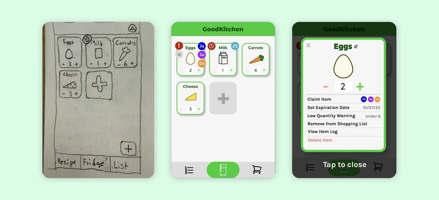
GoodKitchen is a mobile kitchen app with three tabs: an inventory of what's in your fridge, a recipe catalogue based on what you have, and a shopping list creator that automatically updates when you're running low on something.
We designed and prototyped it over a semester as a team of four, each focusing mainly on one page of the app. I created the app's design language in Figma so the whole app would stay consistent, and I designed and built the inventory (fridge) page.
- My Role
- UX Designer & Front-End Developer
- The Team
- 4 students (CS and Immersive Media Design)
- Our Timeline
- Sep–Dec 2025
- The Tools
- Figma, HTML, CSS, JavaScript
Where We Started
Our original pitch was an app for roommates and anyone who regularly stays in more than one place, like a college student who lives on campus during the week and goes home on weekends. You could share multiple fridges, claim an item as yours so your roommates know not to drink your sodas, and set a "running low" quantity so items get added to the shopping list automatically.
After the first phase of the project, where we created our pitch, got early feedback, sketched low-fidelity prototypes, and created our single high-fidelity design language mockup in Figma, our professor asked us to instead focus on a single fridge and a single user. This was a major change, but we viewed it as a shift in our client's needs. We had to adapt.
Our New Focus
Perishable ingredients often end up wasted because people don't have ideas to fully use them up, or because they are simply forgotten. This leads to unnecessary trips to the store, costing the user time and money, not to mention the guilt associated with wasting food.
Our new goal was to create an app that alleviates this food waste issue by tracking what's in your fridge, automatically adding items that are running low to a shopping list, and suggesting recipes based on available ingredients.
Who We Designed For
To guide our design process, we created four task scenarios and three user personas. Here's an example of each, both written by me.
Task Scenario: Sam
Sam is a woman in her forties, working as the manager at a local department store. She has three children aged 20, 13, and 8, who all live with her. She is not a big fan of technology, but rather enjoys working with people. She would like help keeping track of groceries and planning meals, especially since her oldest son regularly uses groceries to cook for himself, and her youngest is a very picky eater. She generally enjoys cooking, but tonight she had to work late and is hoping to make a quick meal for her and her two youngest children now that she's finally home.
Analysis
- Sam doesn't love working with technology and is in a rush, so our app should ideally be minimalist and avoid unnecessary screens or buttons.
- Sam's oldest uses the groceries too, so it would be ideal if the app supported multiple users. (from our original pitch)
- She should be able to see ingredients quickly, so she can rule out recipes with ingredients she knows her youngest won't eat.
- She should be able to sort recipes by estimated time, so she can find something quick and easy.
How It Shaped the Final Product
Her scenario pushed us toward a minimal app with as few manual interactions as possible. Whenever possible, we reminded ourselves that the goal wasn't hyper-customization, just enough flexibility to be useful for a wide audience. This helped us realize that cutting down to three main pages instead of five (settings became a menu at the top right of all pages, and we cut meal planning) would make the app much less overwhelming, especially when you're already tired and just wanting to make a quick meal. Additionally, it gave us the idea of sorting recipes by estimated time, so she could more easily find that quick and easy option.
User Persona: Travis
Travis is a 36-year-old man who lives with his wife and their five children. He works a 7am-3pm shift as an accountant at a local auto repair shop, but he doesn't know much about cars himself. His wife is a stay-at-home mom and does most of the chores around the house, but Travis is responsible for grocery shopping on his way home from work, and for cooking dinner.
Travis likes to spend most of his free time with his kids and his wife, going to parks and having picnics. He also enjoys hiking and goes to the gym a few times a week. At home, he mostly enjoys reading books, and his family likes to watch a movie together every Wednesday night.
He and his wife are very health conscious, and keep track of everything they eat. Their kids, however, are picky eaters and don't enjoy most traditionally “healthy” foods. They spend a lot of time trying to find healthy recipes that the kids will actually eat. Their oldest child just got their first car, and they regularly go out to eat with their friends.
On the weekends, Travis likes to relax and not have to worry about cooking, so the whole family usually goes out to dinner on Saturdays, and he usually makes a simpler meal for Sundays.
Analysis
- Travis is very busy, doing his grocery shopping on his way home from work. He needs to be able to check what he needs, without having to stop at home to actually check the fridge.
- He cooks dinner for a family of seven, so he'll have a very different definition of what a 'low' quantity of an item remaining means than a single person.
- His family is health conscious, but his kids are picky eaters, so finding recipes will be hard. It would be great if he could filter out ingredients his kids refuse to eat, and that he and his wife don't want them to eat.
- He wants simple meals on weeknights and Sundays, so recipes should show how long they take and how hard they are at a glance.
How It Shaped the Final Product
This persona inspired the customizable "running low" quantity for each item, because we realized different users will have different needs. It also gave us the idea of filtering out recipes based on specific ingredients, which he could use to avoid ingredients his kids won't eat.
Low-Fidelity Prototyping
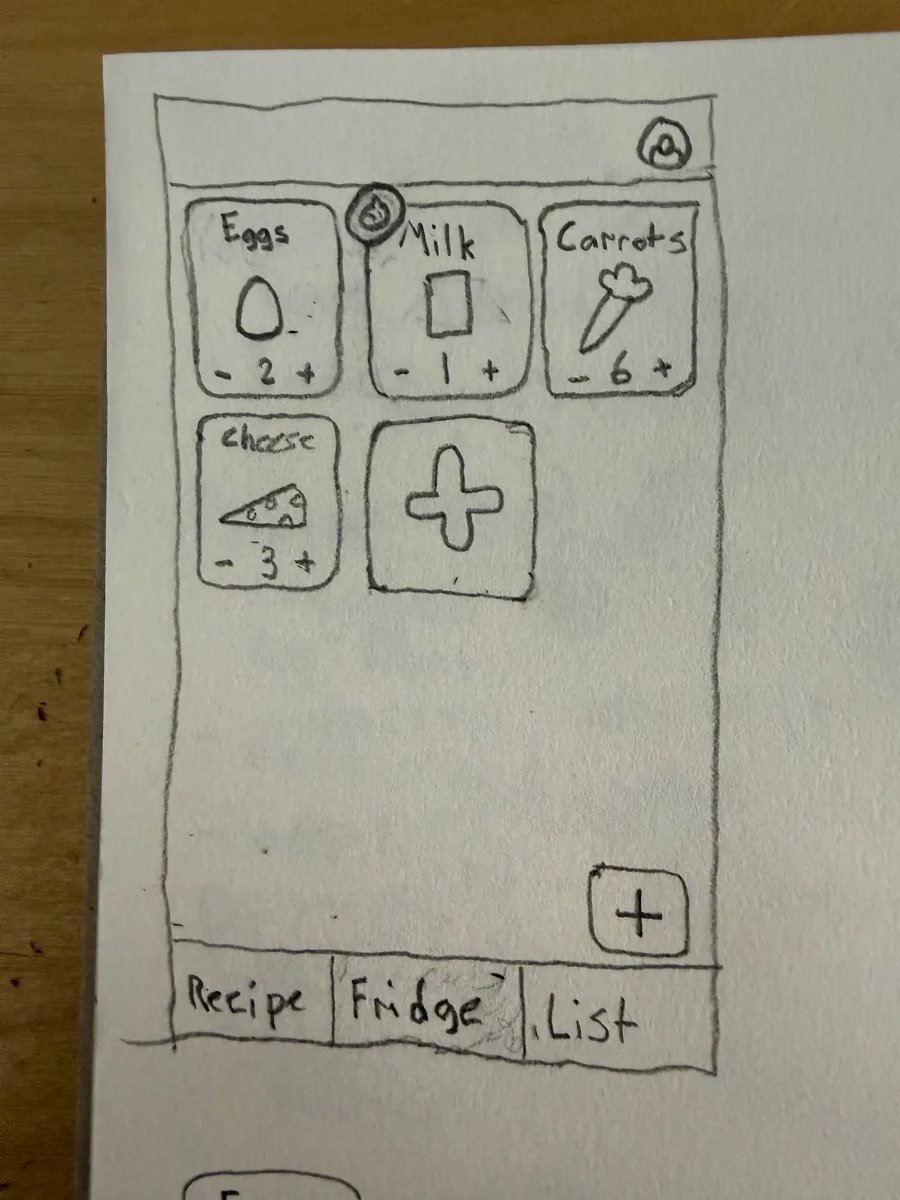
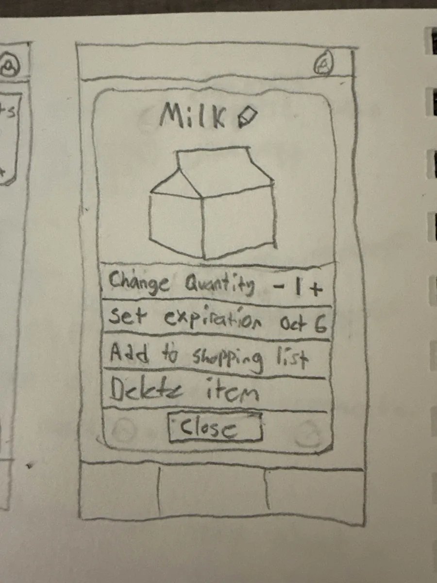
Before starting our digital design, we sketched low-fidelity prototypes on paper. For the fridge tab, I planned a grid of item cards with quantity controls, with additional settings when you tapped on an item.
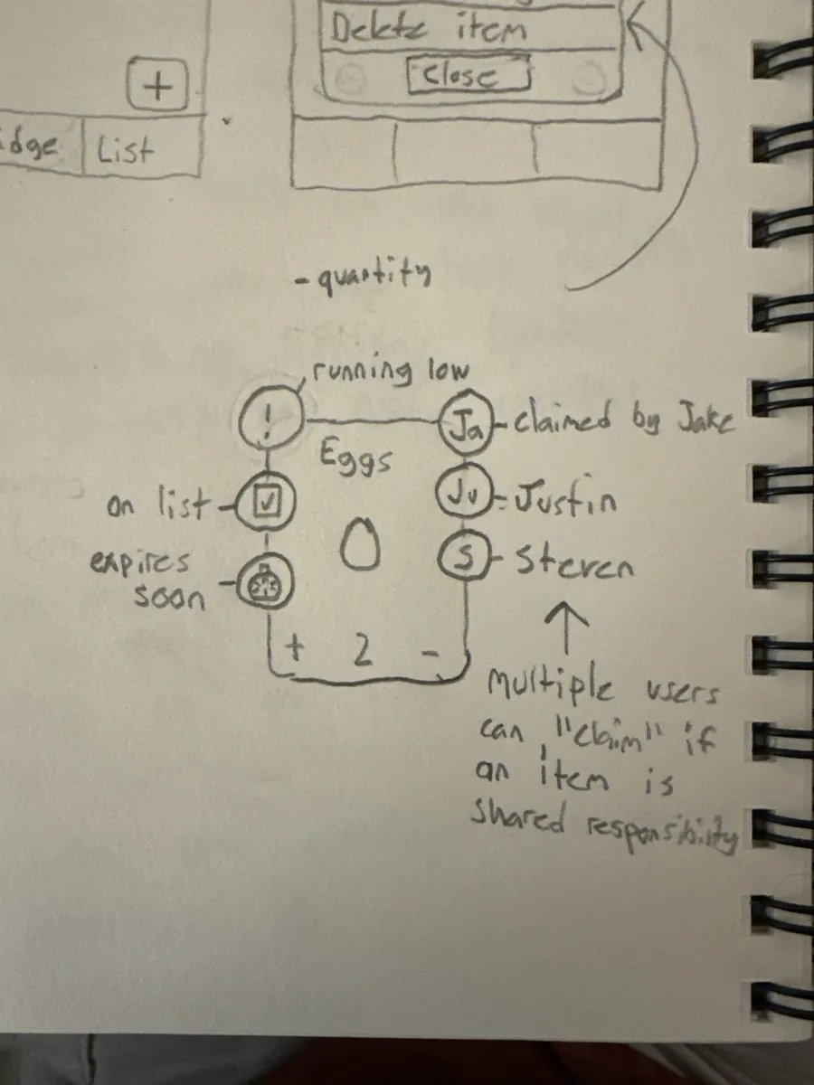
Around each card, I sketched indicators for when an item is running low, already on the shopping list, or expiring soon. There were also indicators for claiming items, since these sketches were paired with our original pitch.
These sketches helped us visualize not just what the app would look like, but also the user flow and what it would feel like to use.
Early Feedback
Each of us showed the paper prototypes to a few potential users: students, recent graduates, and people out of school, like a grocery store worker who cooks in her spare time. They asked for things like:
- Notification reminders about expiring or low items
- A dedicated tab for saved recipes
- Filtering recipes by the foods you have
- Tracking how long food has been in the fridge, so you can use the oldest first
Our Takeaways
Making it Recipe-Focused
A lot of feedback and ideas centered around the recipes page, so we put extra focus there throughout the design process, making sure it was both usable and customizable.
Getting Useful Feedback
Most people defaulted to suggesting new features, so we found it helpful to encourage them to be critical about the existing features instead, and we asked more specific questions.
Design Language
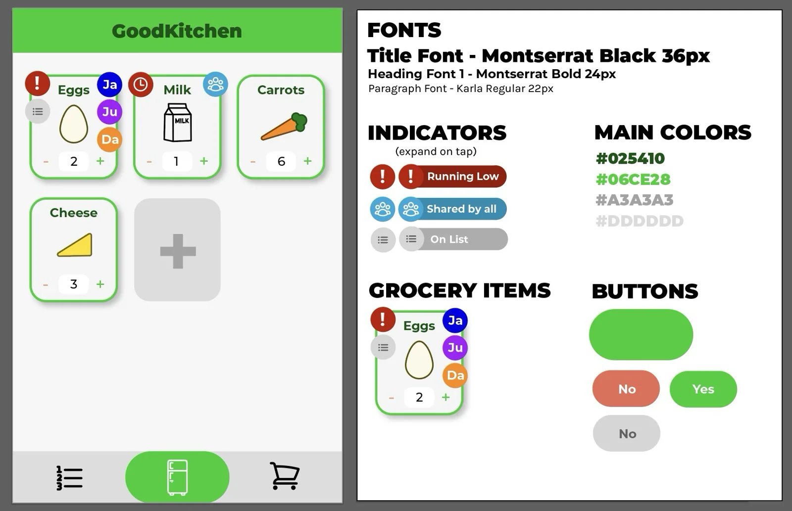
I turned our sketches into a design language in Figma that the whole team could follow: fonts, font sizes, colors, icons, and button styles.
My Thought Process
- Green as the accent: it's a natural color inspired by fresh produce, and it feels healthy. In hindsight, the lighter green is a bit harsh on the eyes.
- Two typefaces: Montserrat Black and Bold for titles and headings, and Karla at 22px for everything else. Montserrat is clean but has character, and Karla is readable at small font sizes.
- Expanding indicators: doesn't clutter the screen too much by default, but users also never have to guess what a symbol means.
- Claim icons: each roommate is a colored circle with the start of their name.
- Accessible quantity controls: changing quantities is the most frequent user action, so we made sure it was a single tap.
- Accessibility-focused: fonts are simple and readable, with 22px being the smallest font size. Color is never the only indicator for anything, so the app is color-blind friendly.
Medium-Fidelity Prototype
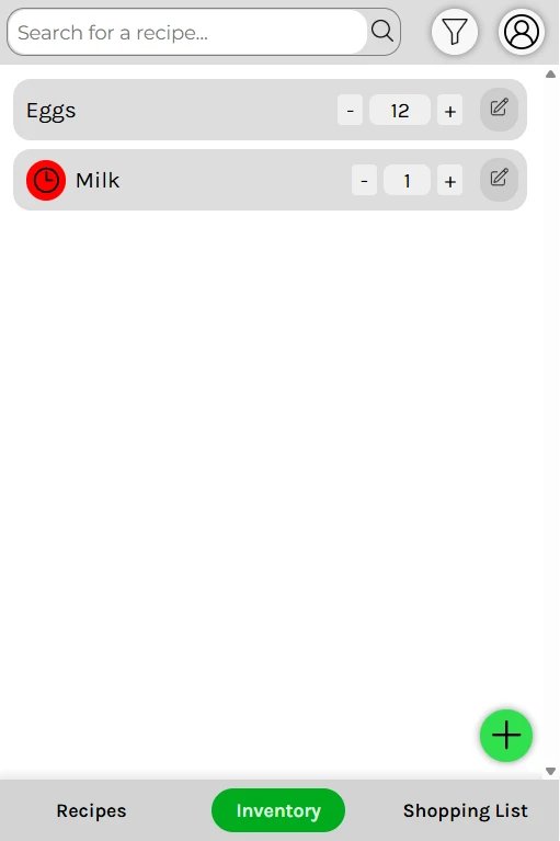
To test our flows with real people, we built a medium-fidelity prototype in HTML, CSS, and JavaScript. I primarily focused on the inventory page and its functionality:
- Adding, editing, and deleting items
- Changing quantities
- Setting expiration dates and running-low quantities
- Searching items
- Filtering items by food group
This prototype focused on user flow rather than looks, so not all of my design decisions carried over. One major decision that came from this prototype was changing from the grid of items to a list. Our professor and one of the TAs pointed out that the grid was too cluttered and overwhelming in our official feedback, so we switched to a list.
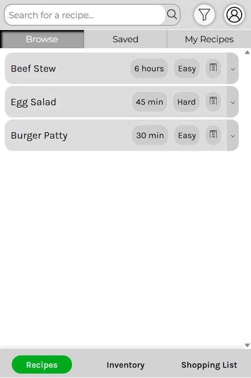
One side-effect of the change was that each page looked quite similar now, so we gave each page its own controls and icons to tell them apart. In the end, I still think we could have done more, so that's one thing I would continue to iterate on in the future.
Inventory
Recipes
Shopping List
Inventory
Testing and Feedback
Think-Aloud User Study
Our prototype was given to another team, who ran a heuristic evaluation and a think-aloud user study. We were also given feedback by our professor and TAs.
The user study went well overall, with the participant adding milk with an expiration date and a "running low" quantity without any issues, and they said everything seemed well labeled.
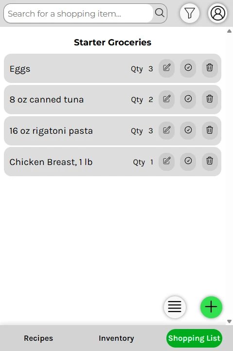
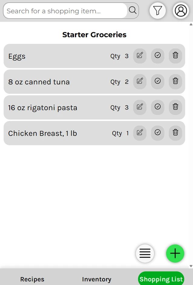
The biggest problem was with our shopping list page. Our prototype confusingly started with a pre-made "Starter Groceries" list, and when the participant was asked to create a new list, they instead just added items to the existing one. The reviewers rated it a usability catastrophe.
Reviewing Another Team
We did the same study on another team's budgeting app, SpendSense. We each did our own heuristic evaluation, then we combined them all and removed duplicate entries. During the user study, we all took notes.
Afterward we combined our notes into common themes/topics, like unclear tab names, data being reset on refresh, and easy-to-make user input mistakes. It was really valuable to do this on an app we had never seen before, because it opened our eyes to potential issues with our own prototype.
Redesigning Based on Feedback
We proposed eight design changes to improve the app based on the heuristic evaluation and user study. Here are a couple of examples:
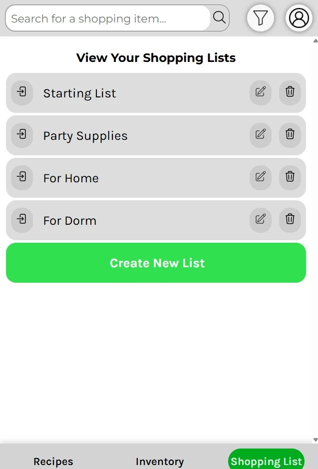
1. Start the shopping list on an overview
Instead of opening on a starter list, the shopping tab would open on an overview of all your lists, like "For Home" and "For Dorm," with a clear "Create New List" button. This addresses the mode confusion from the study, where the participant thought they were in one place when they were in another.
Before
Before
After
2. Add units to quantities
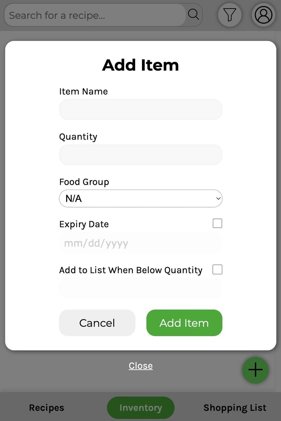
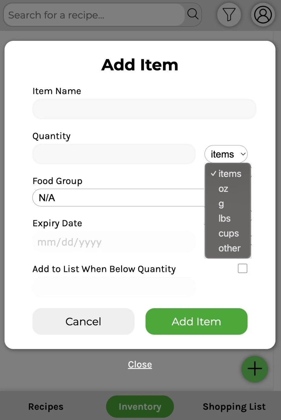
We missed a pretty big ambiguity in our original design: "2" milk could mean two cartons, two cups, or two ounces. We proposed a units dropdown next to the quantity, which would then show up on the fridge page and in the edit menu. (In hindsight, we could have added some kind of percentage option, because most people don't measure every time they pour a bowl of cereal.)
Before
Before
After
Other changes included:
- Fixing the search bar that said "Search for a recipe" on the inventory page
- Letting people edit recipes they created
- Renaming "Saved" recipes to "Favorites"
- Optimizing how you enter recipe ingredients
Reflecting on the Project
Realizing Our Initial Design
Looking back, the prototype doesn't fully live up to the Figma design. Part of that came from narrowing our scope after our professor's feedback, but part of it was also caused by our implementation of HTML/CSS/JS. The medium-fidelity prototype we made was still super useful for improving user flow, but some UI elements were implemented inconsistently because different people made them.
In the future, I would start the medium-fidelity prototype by building a more robust shared component library that the whole team could pull from. They still wouldn't be completely refined aesthetically, but the functionality and appearance would be consistent across the whole app, which makes it less confusing.
Who We Left Out
As part of reflecting on the project and our process, we thought about what assumptions we had made and what user groups were left out by our design. Most obviously, we didn't consider users who might have difficulty using a touchscreen or who have limited vision.
In households where multiple people use ingredients from the fridge, it is unlikely they will all properly track what they used all the time. To help households where people forget to log what they use, a future version could add reminders, streaks, or store discounts.
Closing Thoughts
One of the biggest things that stuck with me from this project was the importance of testing with real users and getting frequent feedback. There were times when I thought our design was solid, but feedback suggested otherwise, and I had to make changes that I personally disagreed with, like switching from the grid to a list. I think it's really important to be able to do that, and I believe we ended up with a better final product because of it.